
Office Address
18/09, Block B, Bosila City R/A
Mohammadpur, Dhaka - 1207
Phone Number
+880 9638 667701
+880 1711 871722
18/09, Block B, Bosila City R/A
Mohammadpur, Dhaka - 1207
+880 9638 667701
+880 1711 871722


 by Naeem Patoary
A successful e-commerce website is not simply a place to display product images, names, and prices. This becomes even more important when the platform is built for a category as sensitive and need-driven as Baby & Mom Care.
For parents, the buying journey is often very specific. They want to find the right product quickly, understand whether it is suitable for their needs, compare relevant options, check availability, and complete the order without unnecessary complexity.
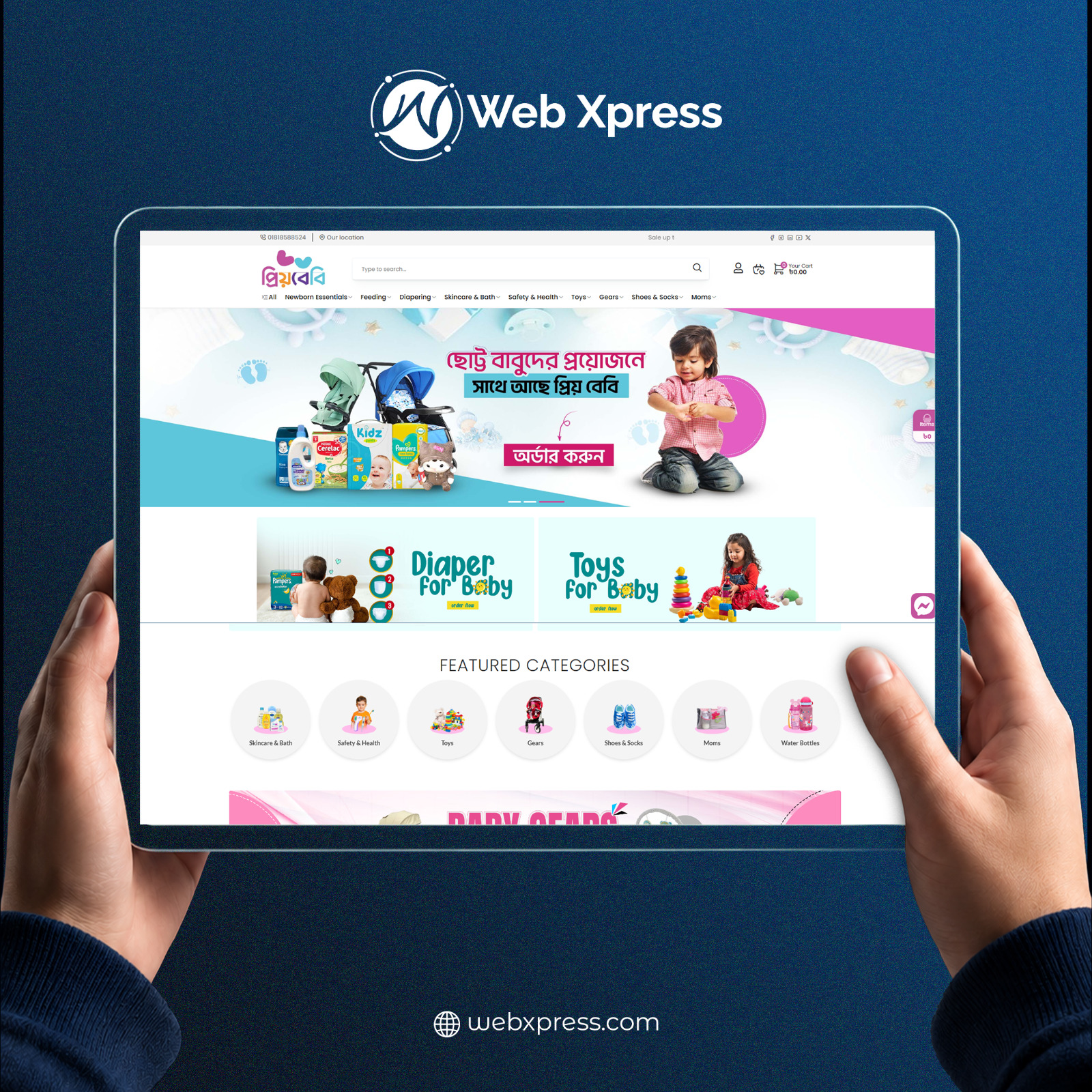
With that goal in mind, we built a complete Baby & Mom Care e-commerce platform for PriyoBaby.
PriyoBaby is a specialized online store focused on baby and maternal care products. The platform brings together a wide range of products, including newborn essentials, feeding products, skincare, diapering items, clothing, toys, baby gear, and products for mothers.
However, our objective was never to build just another online shop.
Our goal was to transform a large Baby & Mom product collection into a well-organized, easy-to-use, parent-friendly digital shopping experience where customers could quickly discover the right products, review detailed information, and place orders with confidence.
The shopping behavior of a parent is very different from that of a typical e-commerce customer.
A customer does not always arrive with a specific product name in mind.
They may be wondering:
This means a customer may search by product name, browse through categories, explore brands, filter by price, check availability, or use other product attributes before making a decision.
We designed the PriyoBaby platform around this real-world shopping behavior.
The website structure, navigation, product discovery experience, and purchase flow were all created to support a customer from the moment they identify a need to the moment they complete an order.
One of PriyoBaby’s greatest strengths was also one of the biggest challenges of the project: its extensive product catalog.
A Baby & Mom Care store naturally contains a wide range of categories.
For example:
Without a proper structure, a large catalog can easily become confusing.
A new visitor may not know where to begin, which category to choose, or how to narrow down hundreds of available products.
So the primary challenge was clear:
How do we organize a large Baby & Mom product collection in a way that feels simple, structured, and easy to navigate for every customer?
The first step was to create a clear and scalable category and subcategory structure.
A large product catalog is only useful when customers can easily understand how the products are organized.
If users cannot identify the correct category, the size of the catalog quickly becomes a disadvantage.
We therefore focused on building a logical information architecture where customers could move naturally from broader categories into more specific subcategories and product groups.
This helped make the browsing experience more predictable and significantly reduced unnecessary confusion.
Not every customer prefers to browse through categories.
Some users arrive with a specific product, brand, or keyword already in mind.
For that reason, product search was treated as an important part of the overall user experience.
The objective was simple:
Help customers reach the product they are looking for in as few steps as possible.
For a large e-commerce catalog, a strong search experience is not only important for usability. It also plays an important role in conversion.
The faster a customer can find a relevant product, the more likely they are to continue toward a purchase.
Even within a single category, customers may have many different requirements.
For example, a customer browsing diapers may want to narrow products based on:
Category browsing alone would not be enough.
We therefore emphasized a filtering experience that allows customers to narrow down a large product list according to their specific preferences.
This makes product discovery faster and gives users more control over the buying journey.
Categories such as Newborn, Feeding, Skincare, Diapering, Toys, and Baby Gears represent different customer intentions.
We designed the navigation experience so these important sections could be reached quickly from key areas of the website.
Customers do not have to search through multiple pages before reaching a relevant collection.
This approach shortened the browsing journey and made the overall store feel easier to use despite the large number of available products.
Not every product should be displayed with the same priority.
Some products may be newly added, some may be trending, some may be part of a promotional campaign, and others may become more relevant during a particular season.
We therefore designed dedicated merchandising sections for collections such as:
This allows PriyoBaby to actively guide product discovery instead of relying entirely on customers to search manually.
It also supports promotional campaigns and helps important collections receive better visibility.
One of the most important pages in any e-commerce website is the Product Details Page.
A customer may discover a product from a category page, search result, or promotional section, but the final purchase decision is often made on the product page.
For Baby & Mom products, information becomes even more important.
Customers want to understand what they are buying before placing an order.
The product page experience was therefore designed to present important information clearly and help customers make more confident purchase decisions.
Stock and availability information was also included so customers could immediately understand whether a product was ready to purchase.
Finding the right product is only part of an e-commerce journey.
The next challenge is converting that interest into a completed purchase.
For PriyoBaby, we paid careful attention to the flow between:
Product Selection → Add to Cart → Order
The goal was to keep the process easy, predictable, and free from unnecessary complexity.
A customer should not feel confused after deciding to purchase a product.
The journey from selection to order completion needs to feel natural.
Baby & Mom Care customers do not always purchase immediately.
Sometimes they want to save a product for later, compare several options, or return to a previously viewed product in the future.
To support this behavior, we included a Wishlist feature.
Customers can save products they are interested in and revisit them later without searching for the products again.
This creates a more convenient experience for planned and repeat purchases.
A large number of e-commerce customers browse and shop from smartphones.
For that reason, PriyoBaby was not designed as a desktop-only experience.
The platform was built to provide a responsive shopping experience across different screen sizes.
Important elements such as:
were designed with mobile usability in mind.
The objective was to maintain a consistent shopping experience regardless of the device being used.
We did not simply build a website for PriyoBaby.
We created a structured Baby & Mom Care shopping ecosystem.
Every part of the customer journey was considered as one connected experience.
The overall flow can be described as:
Need → Discover → Search → Filter → Explore → Compare → Choose → Add to Cart → Order
Rather than treating each feature as a separate function, we designed them to work together as part of a complete shopping journey.
We developed a full-featured e-commerce platform capable of handling PriyoBaby’s large and diverse product catalog.
The website is designed not only to display products, but also to support the full journey from product discovery to purchase.
The product catalog was arranged into logical categories and subcategories.
This helps customers navigate a large inventory without feeling overwhelmed.
A visitor can begin with a broad category and gradually move toward the exact type of product they need.
Customers who already know what they are looking for can use search to reach relevant products more quickly.
This reduces browsing time and improves the overall product discovery experience.
Customers can narrow down a large number of products using relevant filtering options.
This may include criteria such as:
Filtering makes it easier to find a suitable product without manually reviewing every item in a category.
Many customers prefer specific baby care brands.
Brand-based browsing gives them another convenient way to explore the catalog and find products from brands they already know or trust.
Each product page is designed to provide the information a customer needs before making a purchase decision.
Clear product information reduces uncertainty and helps customers make more informed choices.
Customers can quickly understand whether a product is currently available.
This improves transparency and helps avoid unnecessary frustration during the buying journey.
Customers can save products for later and easily return to them.
This is especially useful for planned purchases, repeat customers, and users who want to compare different products before making a decision.
Different customers prefer different purchase behaviors.
Some users want to add several products to their cart before checking out, while others prefer to purchase a single product immediately.
The platform supports both journeys through Add to Cart and Buy Now functionality.
PriyoBaby can highlight products that are part of promotional campaigns, discounts, or special offers.
This provides additional flexibility for marketing activities and sales campaigns.
Popular or high-interest products can be highlighted in dedicated sections.
This helps customers discover products that are currently receiving more attention.
Newly added products can be presented separately.
This is particularly useful for repeat customers who want to quickly discover the latest additions to the store.
Some Baby & Mom Care products become more relevant during particular seasons.
The platform allows seasonal collections to be presented separately so customers can easily find timely products.
Customer reviews play an important role in online purchase decisions.
The product review system allows customers to see feedback from other buyers and share their own experiences.
This adds another layer of information to the purchase decision.
The website is designed to work effectively across desktop, tablet, and mobile devices.
Customers can browse products, view details, manage their cart, and place orders from different screen sizes without losing important functionality.
For a large e-commerce platform, navigation is one of the most important parts of the user experience.
The navigation system was structured so customers could move easily between important categories, product collections, and shopping sections.
One of the key principles behind the PriyoBaby project was to avoid thinking of features in isolation.
Search, filters, categories, product pages, Wishlist, Cart, and Order functionality all needed to work together.
A typical customer journey may look like this:
The customer identifies a need
↓
Finds the right category
↓
Browses relevant products
↓
Uses search or filters
↓
Views product details
↓
Compares available options
↓
Selects a suitable product
↓
Adds the product to the cart
↓
Completes the order
If any of these steps becomes confusing, the shopping experience can quickly become frustrating.
That is why we gave equal importance to features, navigation, product discoverability, and the overall flow.
PriyoBaby is now more than an online catalog of baby products.
It is a complete digital shopping destination for Baby & Mom Care products.
A wide range of products has been brought together into a structured digital storefront where customers can explore multiple categories from a single platform.
Customers can browse collections such as:
Newborn Essentials → Feeding → Baby Skincare → Diapering → Clothing → Toys → Baby Gears → Moms Essentials
Despite the size of the product catalog, the journey remains manageable through proper categorization, search, filtering, brand-based browsing, and detailed product information.
The entire PriyoBaby shopping experience can be summarized in five simple stages.
The customer identifies what they need for their baby or for themselves.
They use categories, search, filters, or brand browsing to find relevant products.
They review product details, price, availability, brand, and other important information.
They select the product that best matches their needs.
They complete the purchase through the cart or Buy Now flow.
This is the foundation of an effective e-commerce experience.
It is easy to think of an e-commerce website as a combination of product images, prices, and Add to Cart buttons.
But a strong e-commerce platform has a much larger responsibility.
It should help the right customer reach the right product at the right moment.
It should provide enough information to support a confident purchase decision.
And once the customer has made that decision, the platform should make the path to purchase as smooth as possible.
In other words:
Product display alone is not enough. Product discovery matters.
Traffic alone is not enough. The customer journey matters.
Add to Cart alone is not enough. The complete purchase experience matters.
This philosophy shaped the development of PriyoBaby.
As an e-commerce catalog grows, information architecture and user experience become just as important as the technology behind the platform.
Displaying ten products beautifully is relatively simple.
Helping a customer find one relevant product among hundreds or thousands of items is a much bigger challenge.
For PriyoBaby, our main focus therefore remained on:
By bringing these areas together, we were able to transform a large product catalog into a much more structured and user-friendly online store.
PriyoBaby was not simply another e-commerce website development project for us.
It was a project focused on transforming a large Baby & Mom Care product ecosystem into an organized, intuitive, and customer-friendly digital shopping experience.
When a parent visits PriyoBaby, the goal is not to leave them alone in front of hundreds of products.
The goal is to guide them toward the products that are relevant to their needs.
That is why every major component of the platform—
Categories, Search, Filters, Product Details, Wishlist, Cart, and Order Flow
was developed as part of one connected shopping journey.
PriyoBaby now presents its extensive Baby & Mom Care collection through a structured digital storefront that makes product discovery and purchasing easier for customers.
And that reflects our broader view of what a strong e-commerce platform should achieve:
Understand the customer’s need, make the right product easier to find, provide the information required to make a confident decision, and turn that decision into a smooth purchasing experience.
PriyoBaby — Baby & Mom Care Shopping, Organized for Parents.